Background
I worked with Netflix's Talent Acquisition team on tools to attract and manage talent. They needed to source and track candidates for productions with huge crews running on completely different schedules, and nothing organized existed to support that.
The ask became two products: a public site that shows the research and machine learning work Netflix does, to attract the people who want to do it, and an internal site for the team to find the right talent.
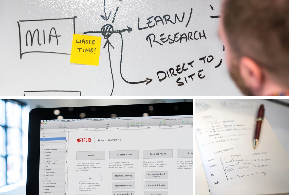
Discovery
I hadn't worked with talent-pool management before, especially not at Netflix's scale. It was also my first time working inside Lever, the recruiting system their team already ran on.
Discovery sessions were built around how they actually worked: how they managed leads, and how they liked to go find new ones. We realized we needed two products. One would bring new people in, and the other would help the team make sense of who to go after.
The open question was how to make dense research feel inviting to someone who had never thought about working at Netflix.
Challenges & Opportunities
Challenges
- Organize dense, growing research so a visitor could scan it and find something fast. There wasn't a well-solved pattern for this yet
- The internal site had to work across multiple analyst teams with different focus areas (machine learning, film and production, and more), so it needed to be flexible and searchable
Opportunities
- Machine learning was generating real buzz, and Netflix had already amassed a lot of research to show
- Netflix's own brand and motion language gave me a head start on hierarchy
Ideation
I started by leaning into Netflix's brand, since I was excited to work with it. Some of the early designs felt a little too “consumer”. The brand is built for an app where people browse and watch, and this was dense information that needed a different structure.
There were two audiences to design for. The public research site needed to be legible, attractive and worth scrolling. The internal tool needed to be fast, efficient and easy to pick up. Both had a lot of information to organize, so the main design work was grouping the research in a way that was searchable and filterable but still digestible.
Research sessions with the Netflix employees who would use the internal tool made the priority clear: speed was king. One of them told me, "I have to find talent for hundreds of shows, I want to move faster." So the internal tool got even denser, with everything as scannable and quickly navigable as I could make it.
Results
What shipped
- v1 of research.netflix.com, with a full design system built for it
- An internal Market Intelligence tool giving analyst teams a shared, searchable home for their research, built with XFN partners
Impact
The site brought Netflix's research out from behind competitors who were already publishing theirs, and gave recruiters a resource to share with candidates.