Background
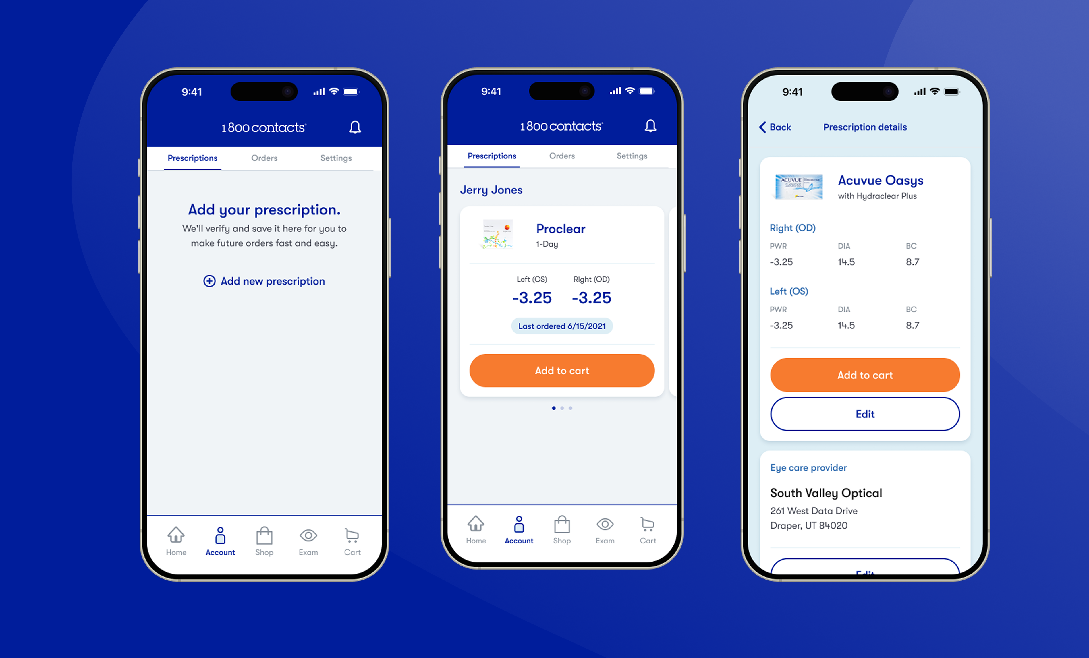
The 1-800 Contacts app and website drifted apart into inconsistent UX patterns and off brand visual language. I was brought onto the mobile team specifically for this initiative. My job, alongside a brand-new PM, was to bring the app back in line with the brand and modernize the experience underneath it. Our focus was on onboarding, prescription management, and checkout.
Discovery
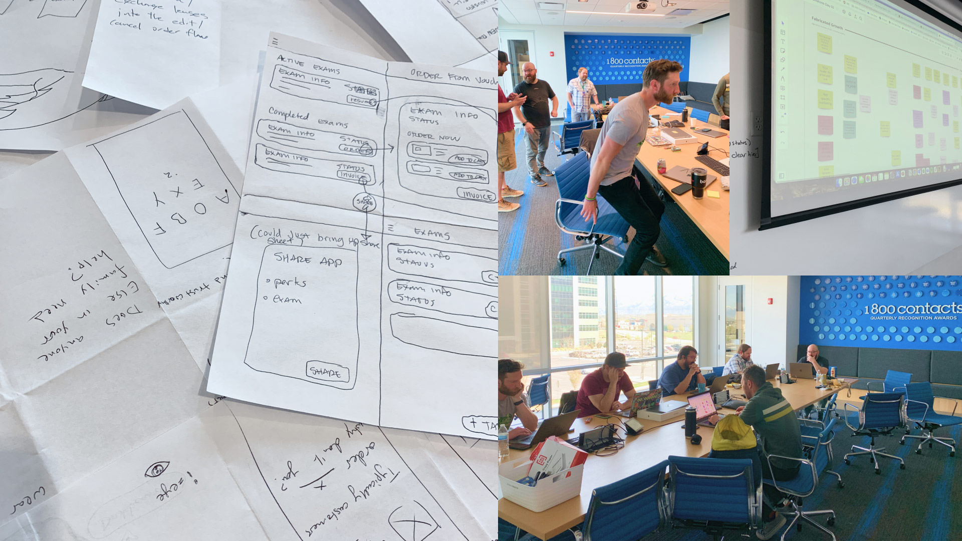
I ran a full UX audit across the app early on. What I found was an engineering team that had clearly put real care into a product they wanted customers to enjoy. But without a dedicated design system to hold it together, the app became inconsistent and messy.
Alongside the audit, I ran stakeholder interviews to understand what "on brand" needed to mean in practice, and put early prototypes in front of internal employees to pressure-test direction before committing engineering time.
We had already validated and shipped Rx Management flows on the web so it was a no brainer to introduce those flows to the app as well.
The business goals took shape alongside the new PM: grow new signups, and increase retention past single purchases.
Challenges & Opportunities
Challenges
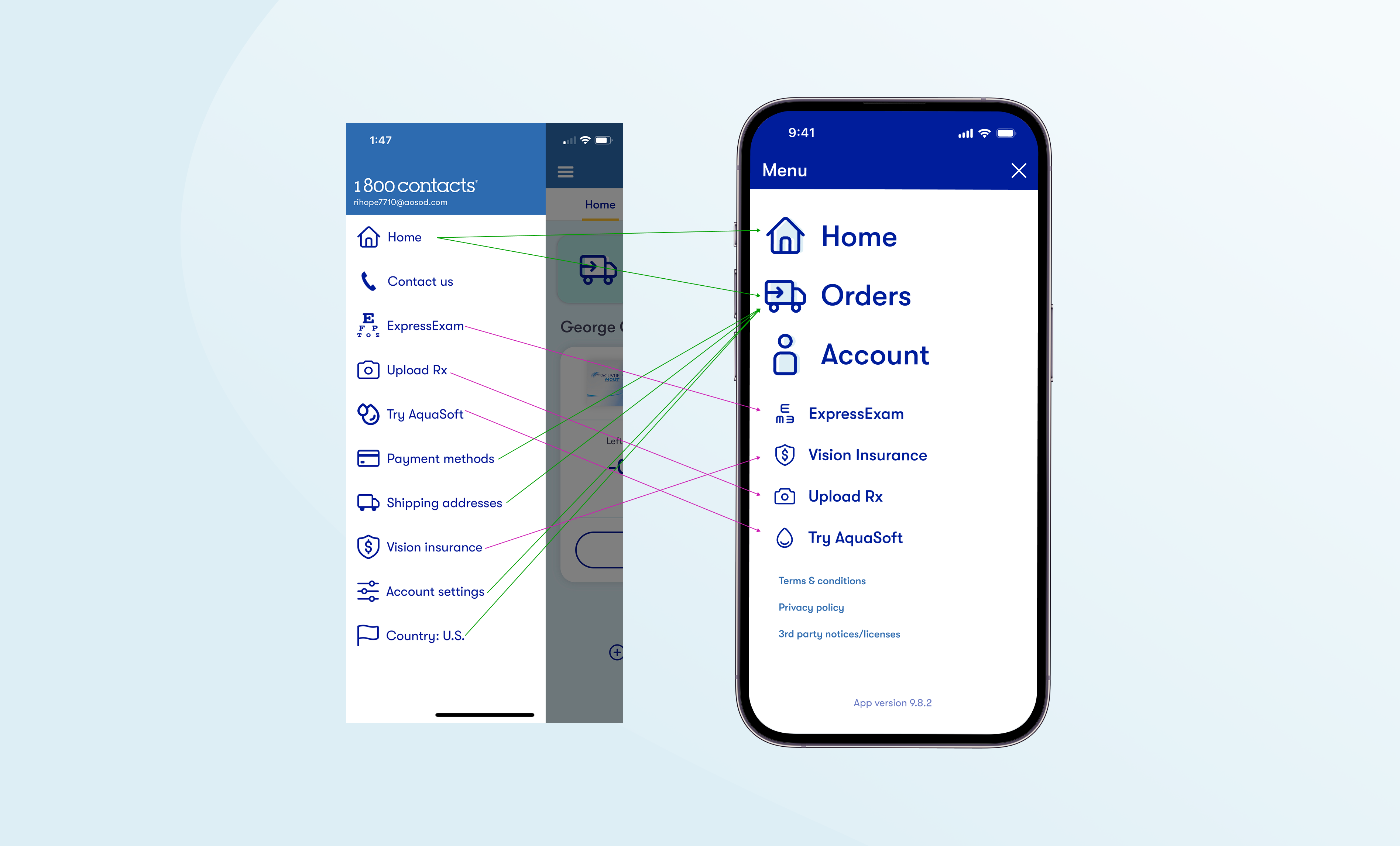
- UI that had emerged from each new feature, without a shared system to hold it together
- A visible gap between the app and the brand guidelines. (Wrong colors, wrong patterns, etc)
- Several complex flows (prescription management, cart and checkout) that needed to work harder, not just look better
Opportunities
- Web had already validated a better Rx Management UX flow giving us a structure to follow and an easy UI lift
- A real UI system (cards, templates) could unify the whole app at once, rather than fixing screens one at a time
- New product surfaces enabled more cross collaboration between app and other teams.
Ideation
There wasn't really an "aha moment" for this project. Instead it was just taking it on step by step, evolving over rounds of refinement.
The Rx Card is maybe the clearest example: what started as a fairly literal port of the information from the old page went through several iterations. I wanted to tighten hierarchy, and simplify actions. I tested which prescription details actually needed to be visible at a glance versus one tap away before landing on the version that shipped.
This same approach was taken for all of the app. I mapped out all the information we needed to port over both as information architecture and as content. I reorganized that and evolved it iteration by iteration with the team.
Results
What shipped
- A new onboarding flow
- A unified UI system using a defined component system for all screens
- Redesigned prescription management (the biggest lift)
- Redesigned cart and checkout (the other biggest lift)
- Infrastructure for marketing to place ads directly in the app
How it was validated
We didn't run formal usability testing before launch. The audit findings and internal prototype feedback already made the direction clear enough to move. Instead, we validated after release: watching whether people actually engaged with the new card patterns, whether app usage held steady or grew, and tracking retention and signup trends against the baseline.